This report marks a major milestone in A&L’s now leading position in the market for advanced performance in energy efficiency. It celebrates the creation of unified story for one of the industry’s most important performance releases: ComfortSmart Hybrid. As Australia chases more demanding expectations in energy efficiency, A&L is now positioned to lead the conversation.
What follows is the culmination of a true partnership, pairing A&L’s deep product expertise with August’s strategic and creative direction, to create a comprehensive campaign that elevates Hybrid’s strengths and empowers A&L’s team to share its story with clarity and pride.
higher engagement with ComfortSmart Hybrid than industry average
of traffic to ComfortSmart Optimal from organic search
increase in traffic to ComfortSmart Optimal landing page
of traffic to ComfortSmart Hybrid via email
This campaign elevated Hybrid’s core value propositions into a brand platform that feels modern and distinctly A&L. By developing a narrative that was simple enough to land quickly, yet strong enough to carry Hybrid across multiple channels, it gave sales teams a sharper story, customers a clear reason to choose Hybrid, and a cohesive foundation for all campaign elements to build from.
Surrounding the central Advantage in energy performance concept, we crafted a refined messaging framework for each audience group, ensuring they all receive clear, tailored narratives that speak directly to their needs.
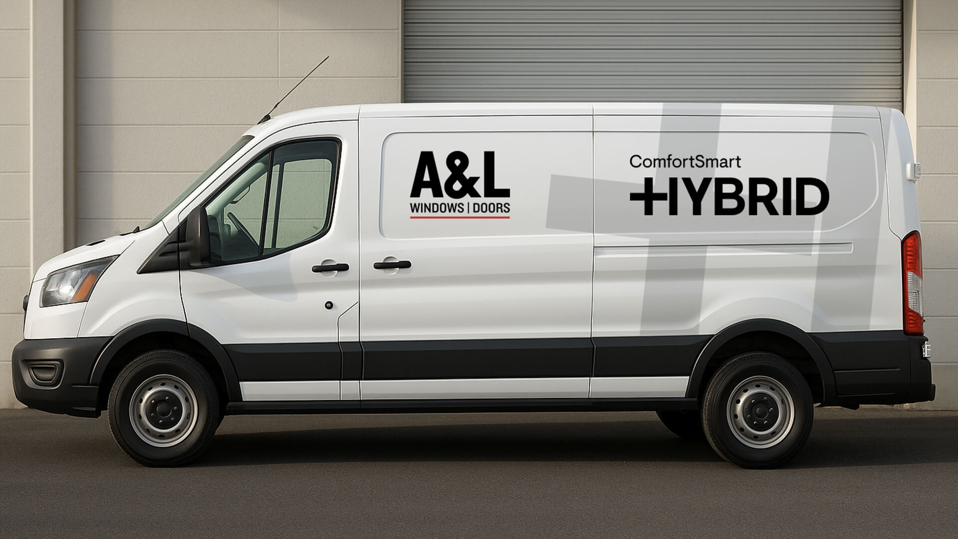
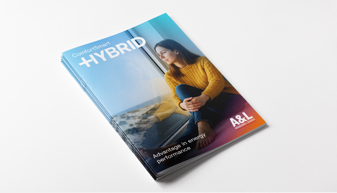
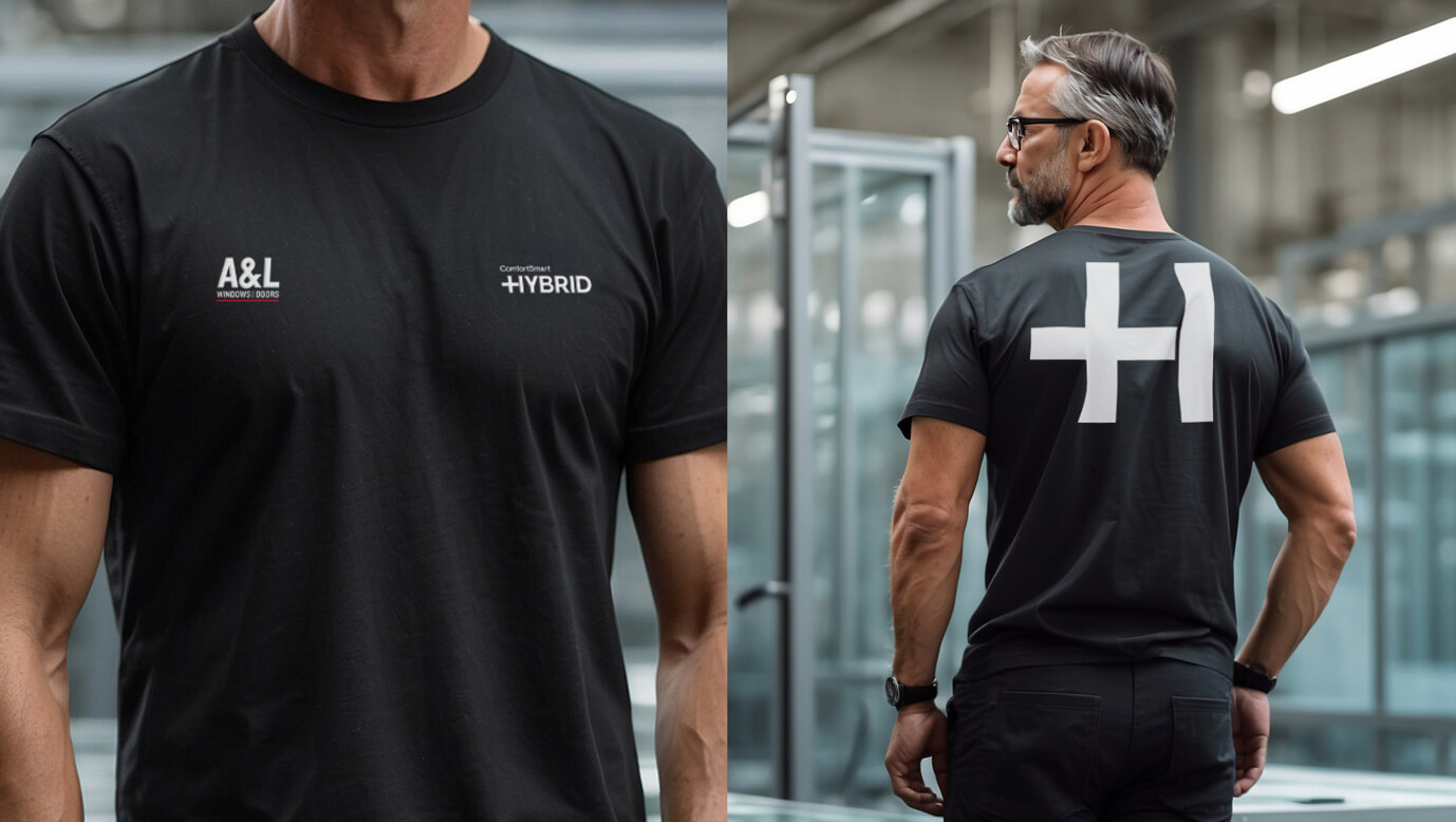
Hybrid’s value was brought to life with a sophisticated visual language that was embedded across all campaign outputs, strengthening brand clarity and confidently positioning Hybrid for what it is: a market-first and a major industry interrupter.

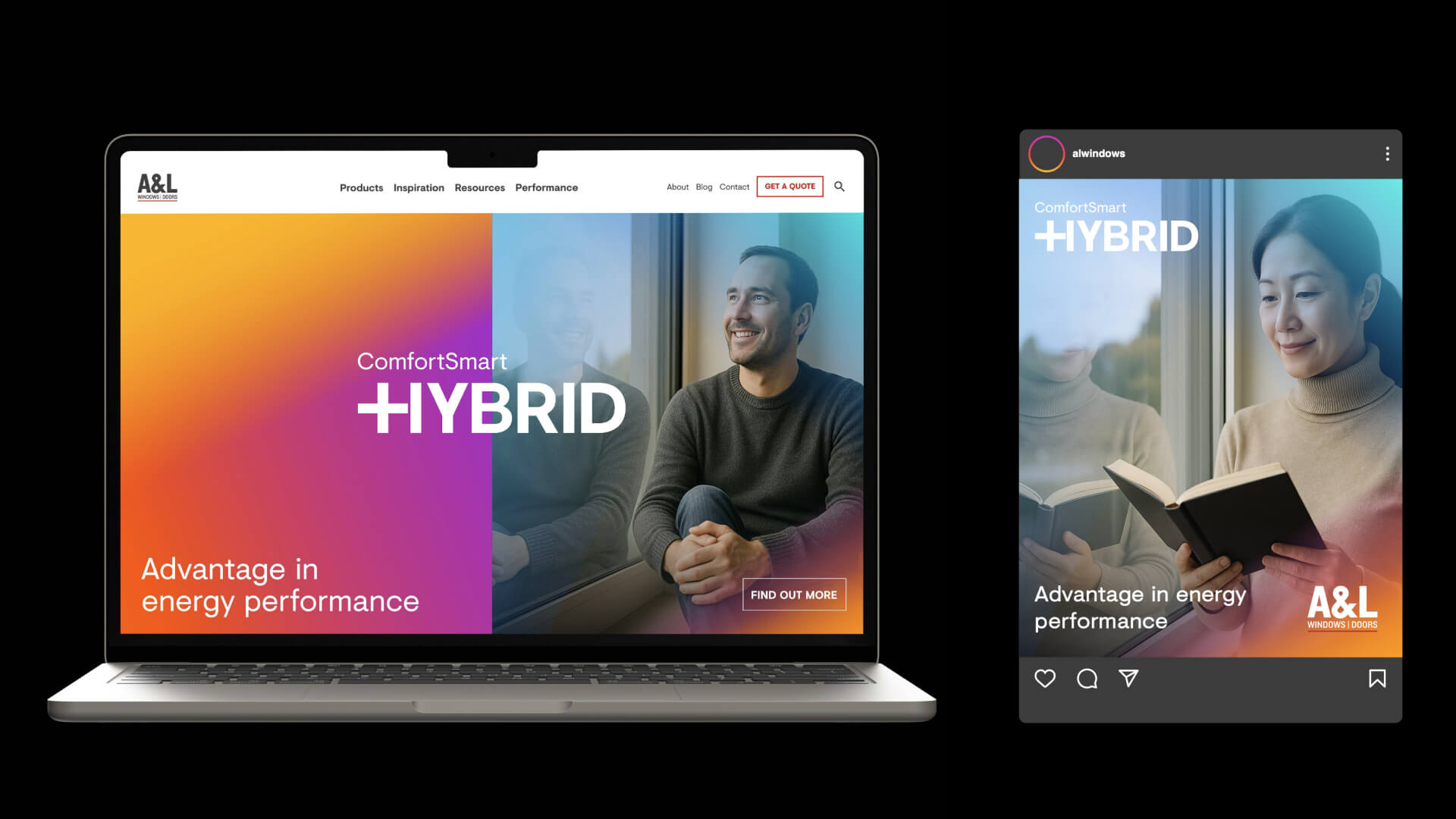
The visual identity for ComfortSmart Hybrid is built around a simple idea: reveal the power of the product’s invisible performance. Since Hybrid’s breakthrough technology sits quietly inside the sash, the design system works to bring that advantage to the surface through colour, form and motion to express what the eye can’t see.
A key element of this system is the isolated plus sign. This subtle mark becomes a visual shorthand for the campaign message. Across layouts, it appears as a small moment of uplift: an indicator of enhanced performance and the best of both worlds between performance and affordability.
Colour plays a parallel role. Warm-to-cool gradients echo the flow of heat transfer, helping audiences intuitively understand the product’s thermal benefits. These gradients bring the internal mechanics of the window to life, while clean typography and a sleek digital design system reinforce the confidence and simplicity at the heart of Hybrid’s offering.
Every component of colour, typography, iconography and gradient behaviours forms a modular toolkit that can scale across campaign channels, from landing pages to sales presentations.
Together, these propositions form the backbone of the Hybrid narrative. They give the campaign clarity, they give audiences confidence, and they give A&L a unified way to articulate what makes Hybrid not just different, but distinctly advantageous.
To support the campaign with a digital experience worthy of Hybrid’s innovation, A&L and August developed a dedicated landing page designed to make the product’s performance both discoverable and intuitive.
3D renders were created to show Hybrid’s unique technology with clarity and precision, turning a traditionally hard-to-explain technology into an accessible visual journey. From heat-flow colour
To support the campaign with a digital experience worthy of Hybrid’s innovation, A&L and August developed a
Every component of the landing page was designed to work seamlessly with the campaign’s visual identity and messaging. The gradients echo thermal movement. The clean layout mirrors Hybrid’s sleek integration within existing frames and installation practices. And the messaging a synthesis of Hybrid’s four key value propositions.
The result is a digital platform that doesn’t just explain Hybrid but demonstrates it.